Connect and Prayer Cards
print design

the goal
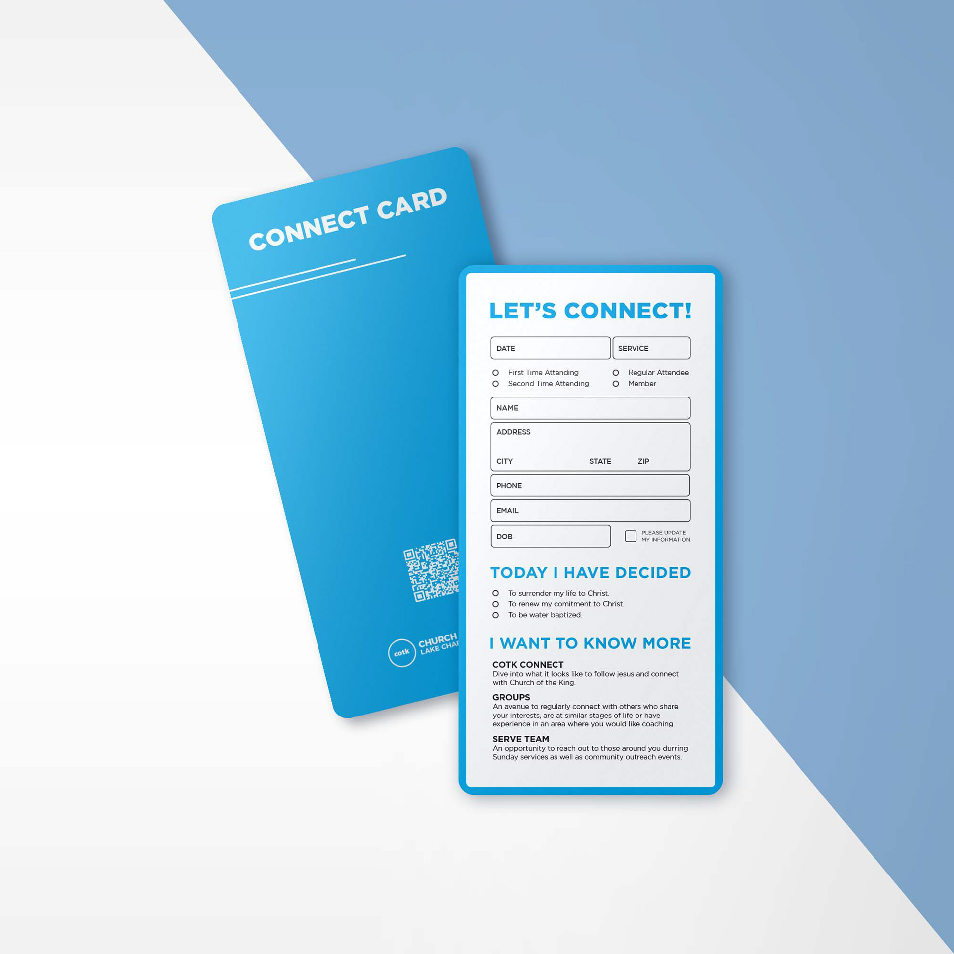
Create physical forms that allow people to connect with the organization in a seamless and modern way. Times have changed in the world of print design, prints must now offer the consumer the option to continue filling out the physical form or access the same information digitally. This is made possible through the implementation of Quick Response Codes, which allow the users to easily scan and continue the process of filling out the form with their smartphones.
the process
I opted to use rounded corners for these prints because I have noticed a trend where the audience that I am designing for is more comfortable picking up print material that does not have sharp corners. It's a subtle difference but since the goal is to create prints that people are comfortable using then rounded corners were the right choice. I continued using rounded shapes throughout the print design like the form fields and even on the corners of the QR codes. I believe it contrasts nicely with the geometric lines of the organization's core font family Gotham.
I primarily used Adobe Illustrator to format the text and shapes. Adobe Indesign played a big part in generating the QR codes, which are being tracked using Bitly.com links. I used Adobe Photoshop for the mockups which bring the cards to life. I wanted the customers to see the closest representation of what these prints would look like before placing the print order.


